
Saturday, 26 November 2011
4th Lesson - Eliminate The White On Large Canvases!
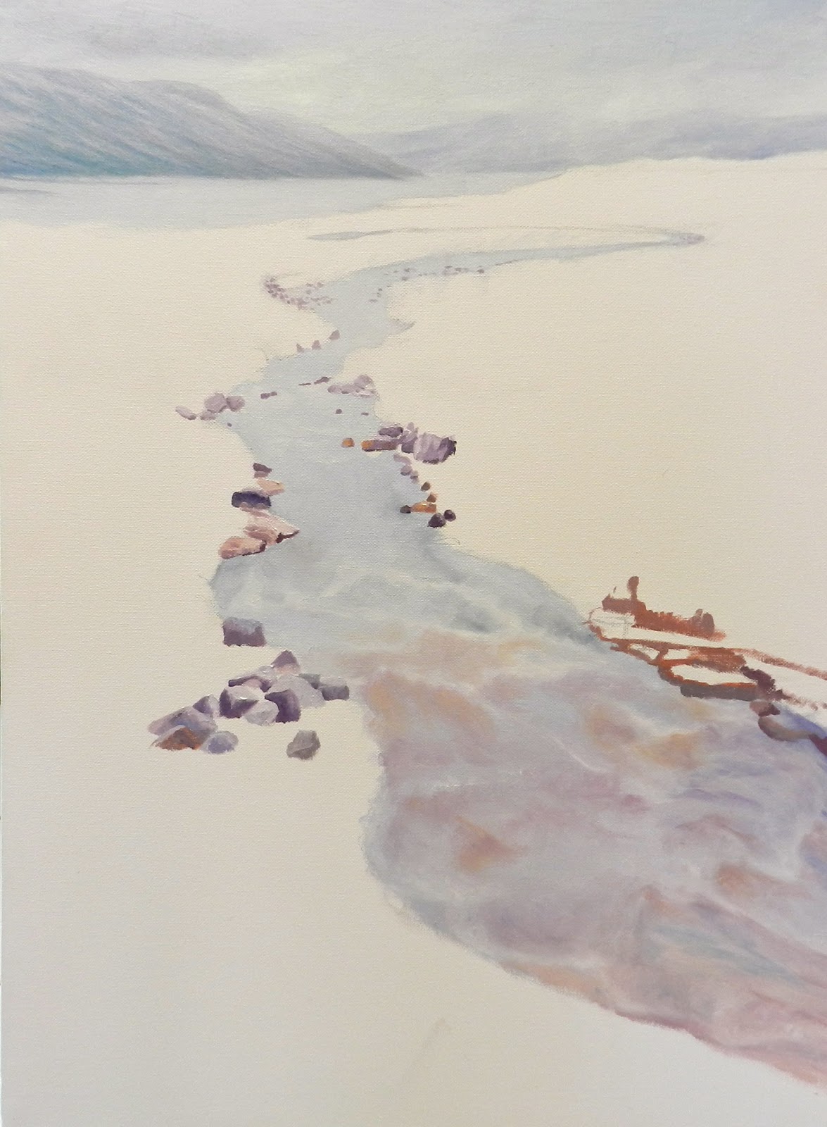
The rocks in the distance will be more purple, less vibrant and very soft. As they come forward we can introduce some colour and sharpen them up a bit - darks become darker and contrast more sharply with the highlights. To make the darker colours, swap the Cobalt Blue for Ultramarine Blue. We've made a thin turpsy wash of Yellow Ochre, Red Gold and Ultramarine Blue to get rid of all that white canvas which can be distracting sometimes.

Friday, 18 November 2011
3rd Lesson - Positioning Objects With The Illusion Of Depth
We have painted the creek in various shades of beautiful pastel colours - soft pinks, purples, and golds. These were feathered off while the paint was still wet. So in this lesson we focused on positioning the rocks lining the creek so that we could then go back to the creek and add reflections from these rocks. Light, small and purpley rocks in the distance, gradually becoming sharper and bigger with a bit more colour as they come forward. The paint is fairly thin, just covering the board so that we can go over it later.

Subscribe to:
Posts (Atom)