Welcome to my art blog. I am a professional artist/art teacher. Here you can follow my free art lessons where I give instructions and advice on how to paint in oils. Check out my range of How To Oil Paint books on Amazon & Itunes, Visit my website (www.howtooilpaint.info) where, with my fellow artist Jo, we give more great tips on how to paint with oils.
Showing posts with label Click here for all "Three Rivers California" lessons. Show all posts
Wednesday, 9 April 2014
Lesson No.21 - The Finishing Touches
Tuesday, 1 April 2014
Lesson No.20 - Adding Fine Detail to Water
I dabbed in the lighter dots and dashes first with a fine brush. In this way, I could see where the ripples were without getting too lost. I then added more colours, following my ripples and further breaking up areas with whatever colour was on my brush. As you paint this section, continually add some dots and dashes to previous areas of the canvas to keep the colour consistent.
Tuesday, 25 March 2014
Lesson No.19 - Simplify As You Paint Away From The Focal Point
One last section of water to go! I have brushed in all the darks first, in the direction of the water flow. I then brushed in all the different rock colours that are reflecting into this section of water. (Those rocks just above this section are big enough to reflect into the water.) I smoothed it all out with the water colours we have been using throughout the painting except the Cerulean Blue - Tasman Blue or Ultramarine Blue with Carmine. This will be a good base before we add some detail with a fine brush.
Tuesday, 18 March 2014
Lesson No.18 - Breaking Up Areas of Nothing Is The Key To This Painting!
I am continually breaking up this section with more darks, more oranges, some light ochres and highlights. Breaking up large areas of nothing is the key to this painting. It is only by a lot of dots and dashes we can create movement in the water. When adding a new colour variant, just dab back into previous sections randomly to keep the colour uniform.
Monday, 3 February 2014
Lesson No.17 - How To Approach All That Detail!
I've now divided that big green space into separate areas with a dark red-blue mix. Put the darks in first, then the highlights, then the detail. It is so much easier to divide this complicated painting into smaller sections so you don't get lost!
Thursday, 30 January 2014
Lesson No. 16 - Covering The White Canvas With A Turpsy Wash
Thursday, 16 January 2014
Lesson No.15 - Adding Colours To Add Interest To A Painting
I am adding more oranges and browns to this middle section of water. Some of the lighter oranges are to indicate reflections of surrounding rocks and the darker browns for hidden rocks beneath the surface. With the Cerulean Blue, I am also making the basic colour of the water a little greener. I think I'll head toward a deeper, more green colour as we get toward the deeper water in the right-hand foreground. Even though I am using the same colour scheme, I like to vary the hue throughout the painting to keep it interesting.
Monday, 6 January 2014
Lesson No.14 - Blocking In Sections To Help Simplify A Detailed Painting
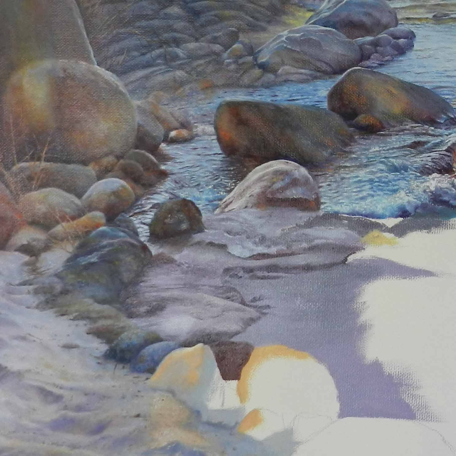
I am painting this landscape in sections because it can be quite complicated otherwise. In saying that, I make sure I am always using the same colours that I started with and constantly dabbing here and there on previous parts of the painting to keep the colours consistent. It also helps to further break up any spots that I previously might have missed.
Saturday, 21 December 2013
Lesson No.13 - Adding Emphasis to Highlights in Oils
As we proceed down the canvas towards the viewer, the colour of the water becomes more intense and the contrasts are stronger. I decided to introduce Cerulean Blue to this middle section of water where the light is strongest. Cerulean Blue is a very pretty blue and will add emphasis to the highlights. Also, for the shadow areas, I am mixing the Cerulean with Ultramarine Blue with a dot of yellow for that greyer, murkier look.
Tuesday, 10 December 2013
Lesson No.12 - Painting Our Way Down The Canvas
We finished the rest of the rocks that are in the water using the same technique as in Lesson No. 10. They have lots of colour and texture. Just remember your light source - coming in from the left in this case.
I have started painting in the water now. Firstly, I blocked the water in with the sky colour Tasman Blue, then adding some red and yellow, greyed it off and painted in the shadowed areas. When painting reflections of the rocks, brush downwards with the appropriate colours, then brush crossways very lightly with a soft, flat brush on it's side. Darken ripples with Ultramarine Blue and red and highlight with a light Tasman Blue. Feather the ripples off so they remain soft and add spots of pure white for that extra brightness. Do small sections at a time as I have done, because the next section in the middle is quite different to paint as there is a lot of movement.
Monday, 4 November 2013
Lesson No.11 - Layering the Background in Oil Paint
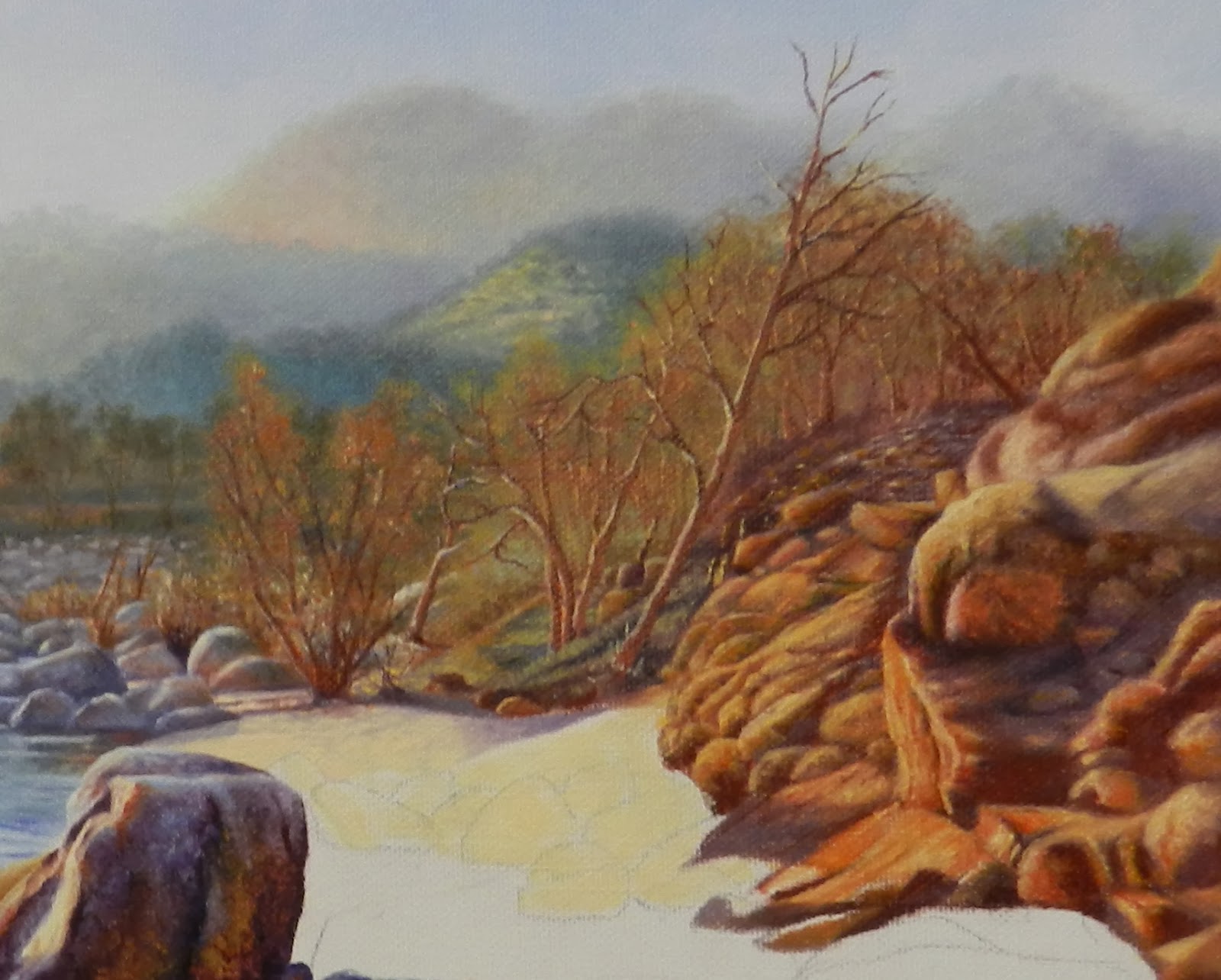
I've decided to work on the right hand side of the painting now where there are trees in the distance and lots of orange rocks. It looks a little daunting at first but if you start from the top and work your way down and forward you can paint it in layers. As objects recede into the distance they lose their intensity in colour, sharpness and tone. So starting from the top, I used Liquin mixed with my premixed muted colours and dabbed in foliage and tree branches, blending them into one another. The Liquin gives a more translucent effect that softens edges. You are also able to go over the same section again with slightly stronger colours and less Liquin. It also dries quickly so you are able to do the final coat with no Liquin. This is where I put in the larger orange trees.
I virtually used the same colours for the rocks. We want the rocks slightly out-of-focus also. I found it easier to break the rocks up into sections, gradually coming down the canvas. With each fresh dab of paint I always work back a little before going forward so that the colours are consistent.
Tuesday, 29 October 2013
Lesson No.10 - Glazing in Oils
I'm using a bit of Liquin now with these big rocks. You can glaze the different colours in layers so that all the colours can be seen. I'm also using a dabbing action with the brush to convey a bit of texture. We will increase the texture with thicker paint as we come further toward the foreground.
Sunday, 27 October 2013
Lesson No.9 - How to Oil Paint Rocks
Now that the rocks are bigger, they can be fun to paint because they can be painted individually. You can make them any colour you want, with any shape or detail. Just remember to use only the colours selected for this painting. We already have a lot of colours for this particular painting, so I would be loathe to add any new colours now. These bigger rocks will be sharper with more colour as they are closer. Put in the darks first, blend in midtones and then highlight. The highlights that are nearly white can be painted in later when the rocks are dry. These two big ones we are painting now are in shadow, so keep them fairly dark.
Wednesday, 23 October 2013
Lesson No.8 - Introducing the Water
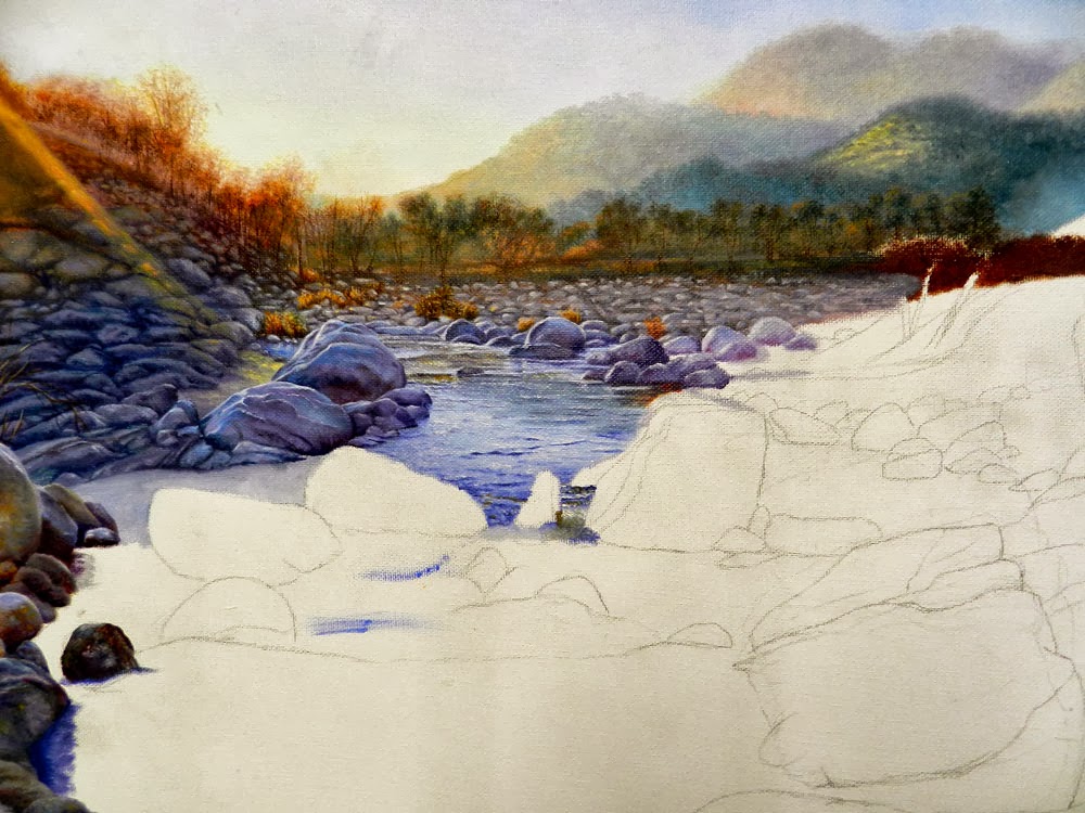
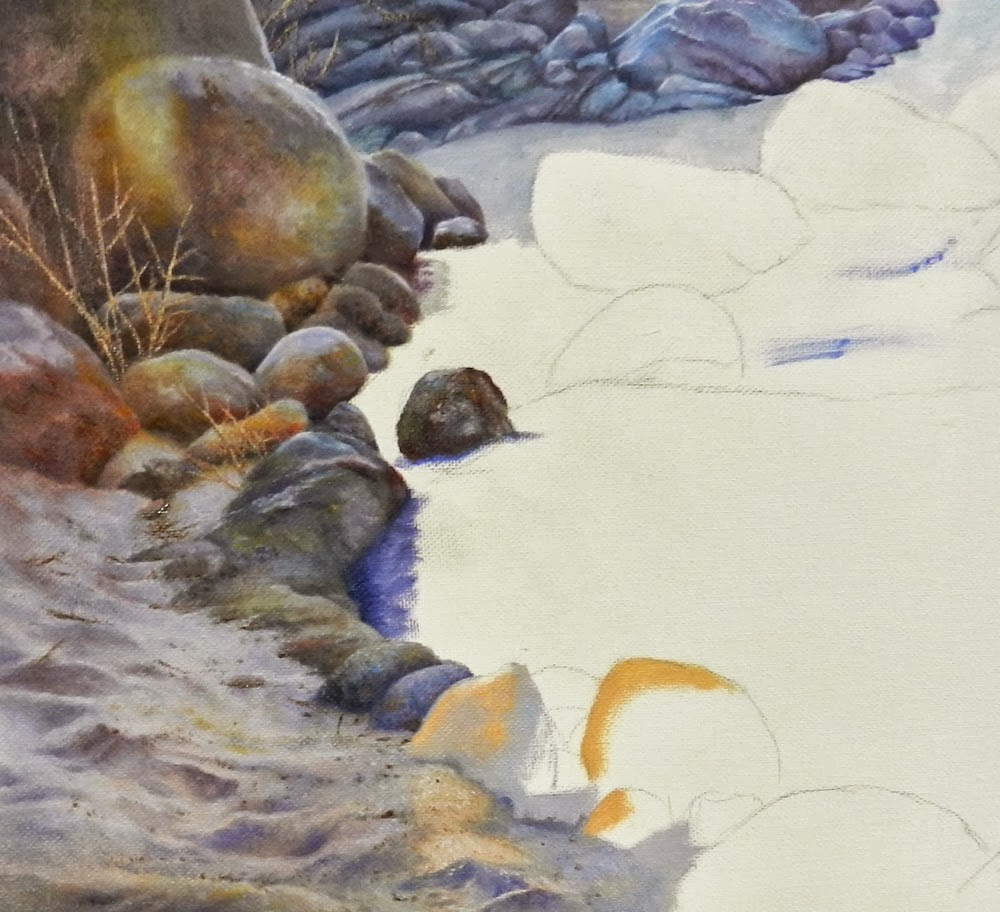
The water's colour is a reflection of the sky. I painted the sky in Tasman Blue, so I will begin with that colour. Brush the area at the top in a very light blue, increasing the colour as you proceed forward. Leave those areas of still water blank as they contain reflections which we will paint in later. To make the darker ripples, add a bit of Ultramarine Blue and Carmine and softly blend them into the wet paint with a fine brush. This mix can also be used to soften the bottom edges of the rocks along the water line. The still water areas we left suggests a reflective colour of the mountains behind the line of trees. I tried to imitate this colour and brushed it in. Everyone's mountains will be a different colour, so use your mountain colours as a guide. Lastly with a very light Tasman Blue, streak this through all areas of the water as a highlight. You might have to use just white for the very top area, if your paint is a bit thick.
Tuesday, 22 October 2013
Lesson No. 7 - Creating Realistic Sand
Sand is full of dips and bumps that create shadows and reflect surrounding light. As our main theme is the orange light emanating from the left of our painting, I firstly blocked in the area with a mixture of Yellow Ochre, Red Gold, Lemon and a dot of Cadmium Red. The shadows were then painted lightly over this area with a mixture of Carmine and Ultramarine Blue. With a darker mix, I accentuated some of the deeper shadow areas. I randomly dotted some Indian Red into the brighter areas for colour. Lastly, with my dark purple mix, I dotted and stroked in some lines for sticks and debris.
Sunday, 13 October 2013
Lesson No. 6
I am now starting to use more colour in the rocks as I proceed further down into the water. For the larger rocks, I am using Ultramarine Blue and Carmine for the darks, Tasman Blue and Carmine for the mid-tones and just a very light Tasman Blue for the highlights. I used a bit of Yellow Ochre for the sandy section in-between the rocks and painted the shadows accordingly with a purple mix.
Friday, 4 October 2013
Lesson No.5 - How to Glaze In Oil Paint
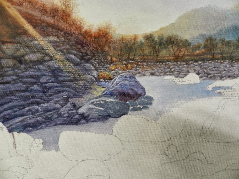
After giving the rocks more detail i.e. darkening darks and adding some highlights, I let the paint dry. The "chromatic abberation" effect from the sun is painted with a mix of Red Light, Cadmium Yellow Deep and a touch of Ultramarine Blue. I then mixed this with some Liquin so that it was very translucent and firstly followed my "sun lines" spreading the paint wider as I came down toward the water. You only need a touch of paint on the brush, circling it around the rocks as you go.
Thursday, 12 September 2013
Blocking in Shapes - Lesson No.4
With a purple mid-tone, I have loosely blocked in rock shapes, covering that area of white canvas. I can then start to break them up into smaller shapes with a very dark purple, before putting on some highlights. In this way, we can slowly go back and detail individual rocks without getting too overwhelmed.
Saturday, 31 August 2013
Lesson No. 3 - How to paint that Golden Glow
The trees on the hill have the light filtering through them, giving the trees a very orange colour. I used the Burnt Sienna for this with a touch of Cobalt to darken them up. Lower down on the horizon, I added some yellow to the foliage to create a greenish hue. Use a fine brush with liquin to paint in the trunks and branches of the trees, making them just stand out against the soft background.
With my light orange mix I lightly painted in the rays of light across the rocks for a guide to painting them in later.
Thursday, 29 August 2013
Lesson No. 2 - Learn How to Keep Those Distant Mountains Out-of-Focus
OK, oil paint colours. I decided to use Tasman Blue for the sky and Cadmium Lemon, Tasman Blue and Carmine for the mountains. When painting the mountains, keep the most distant ones soft, out-of-focus and muted in colour. As you proceed forward, gradually increase the colour and sharpness. I think the light in this painting is it's focal point, so the oranges were painted in softly using a mixture of Lemon and Carmine. Keep the darks fairly dark and the lights equally light keeping them very soft at this stage i.e. no hard edges.
Subscribe to:
Posts (Atom)