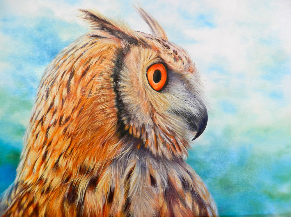
Using the same technique, I worked my way around the chest and back up behind the face. I first used a No.6 brush to brush in the darks and oranges, then swapped to the No.1 fine brush with a bit of liquin and lightly stroked in the creamy highlights. Whilst I had my colours on the palette, I darkened areas that needed to be darker for more depth and picked out some feathers that needed that extra flick of highlight. I used a blue highlight and purple dark for the edges of the bird and feathered this off into the background colours for a soft feathery edge. All it needs now is a signature!
Welcome to my art blog. I am a professional artist/art teacher. Here you can follow my free art lessons where I give instructions and advice on how to paint in oils. Check out my range of How To Oil Paint books on Amazon & Itunes, Visit my website (www.howtooilpaint.info) where, with my fellow artist Jo, we give more great tips on how to paint with oils.
Showing posts with label Click here for all Owl lessons. Show all posts
Tuesday, 20 August 2013
Wednesday, 14 August 2013
10th Lesson - Owl
Tuesday, 6 August 2013
9th Lesson - Owl
Monday, 29 July 2013
8th Lesson - Owl
Monday, 15 July 2013
7th Lesson - Owl
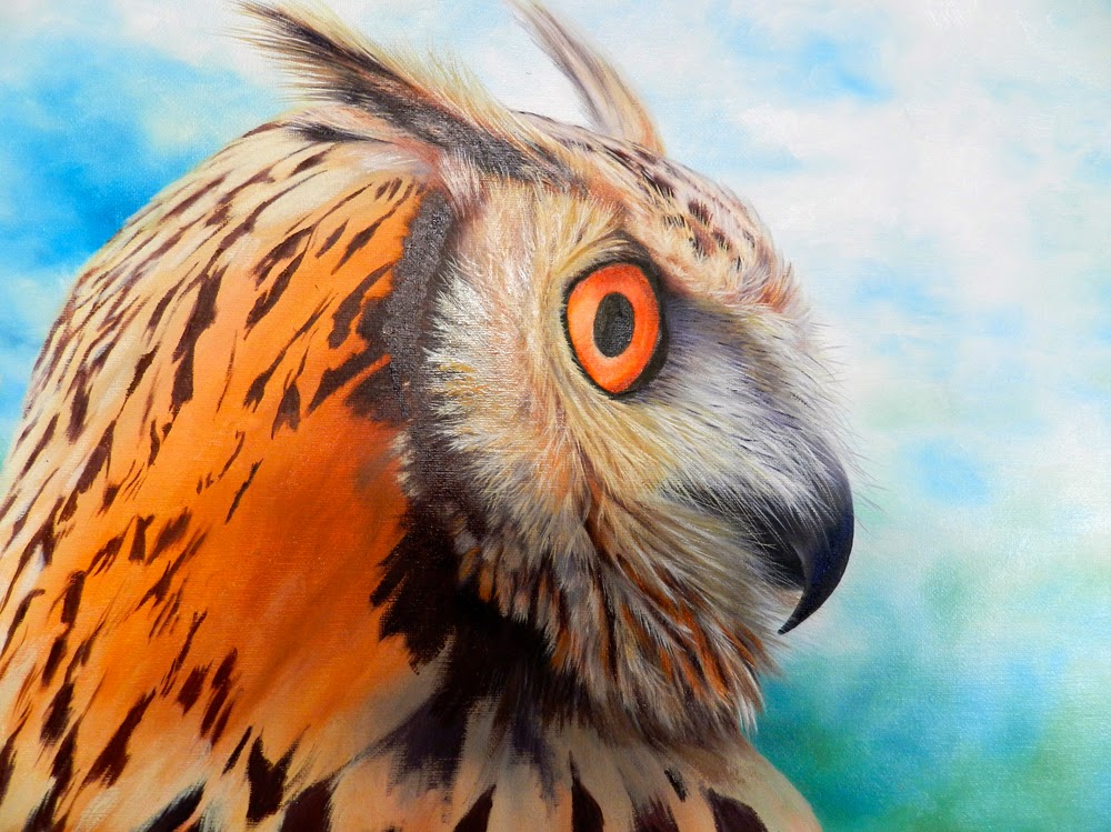
Saturday, 6 July 2013
6th Lesson - Owl
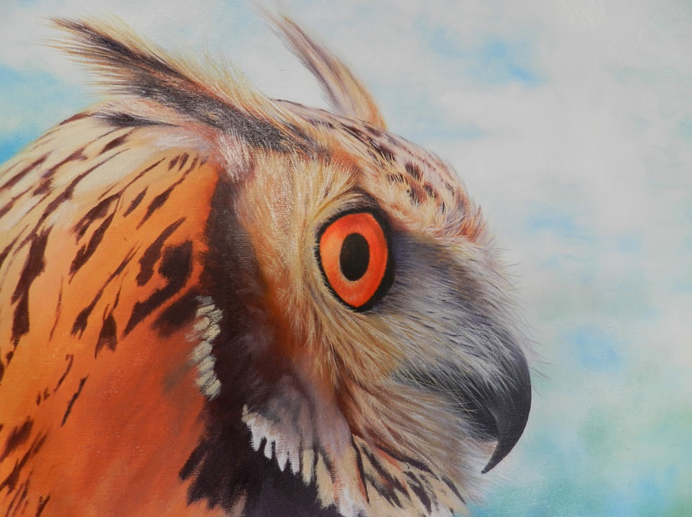
Wednesday, 19 June 2013
5th Lesson - Owl
Thursday, 13 June 2013
4th Lesson - Owl
Tuesday, 4 June 2013
3rd Lesson - Owl
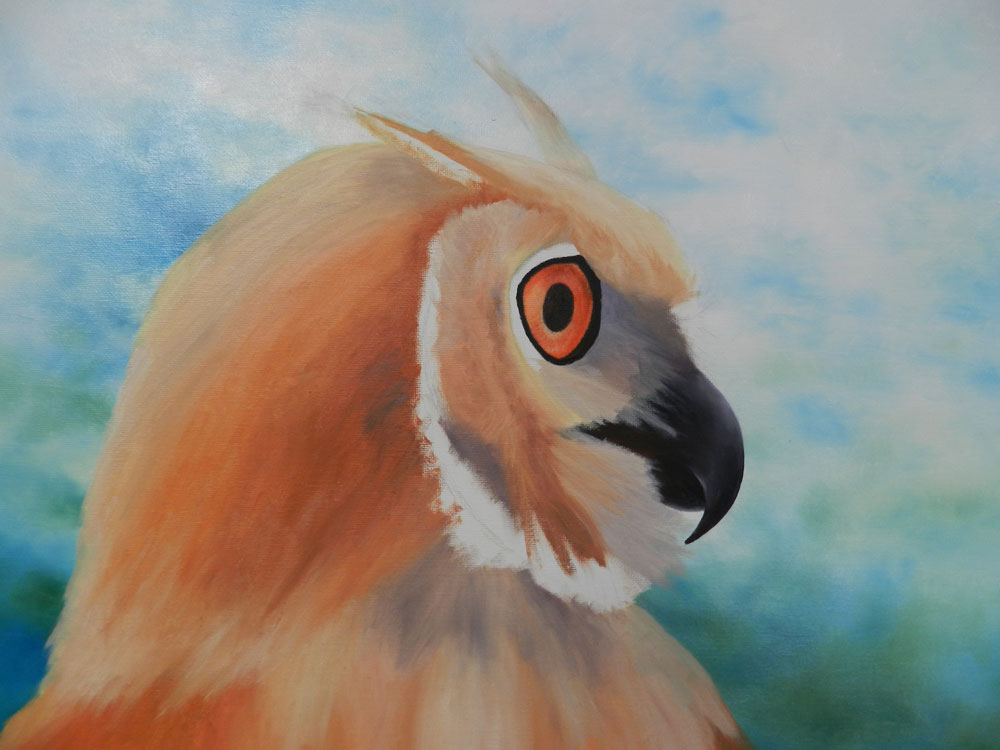
First thing to do is paint in the dark oranges (we will leave the very dark markings for now so that we don't muddy up our bright colours). I used Red Gold, Cadmium Yellow Deep and Indian Red. Make the feathers as dark as you can with these colours because we will layer on the lighter coloured feathers later. Brush all the different tones in for a soft look for now. I added a bit of a purple colour for under the head and eyebrow to create depth.
Tuesday, 28 May 2013
2nd Lesson - Owl
I always start with the eyes on an animal or portrait, so that they start to look real immediately. I used Red Gold and a bit of Cadmium Yellow Deep to brush in the bright orange first. I then darkened the top so that it looks set in under the feathers. I added a bit of Ultramarine Blue to the mix to achieve this. I then highlighted by adding white to the orange mix and stroked outwards from the iris to give it that striated look. Just around the iris, I greyed the bright orange off a bit by adding a pale purple colour. For the blacks, I used a black - something I rarely do. For the beak I also used the black in the darkest areas then highlighted with a nice light purple to suggest the curvature.
Thursday, 16 May 2013
Eurasian Eagle Owl
Our new project for Wednesdays is a photo I recently took in Malta of a Eurasian Eagle Owl. Falconry is an age-old tradition of Malta and I got to hold this guy on my arm and let him fly off to pick up some food in the distance. They are a magnificent bird and up close they are awesome.
So, I wanted this to be an up-close and personal painting. Some of my students drew him a little further back to avoid too much detail. The colours of Malta, with their bright blue, green and yellow boats were the inspiration for the background. I used Cerulean Blue, Cadmium Yellow Deep and Cadmium Red Light and just basically blobbed the colours all over the board. I started with the very light colours and gradually made them darker. I then made some shadow colours for an even darker tone e.g. blue mixed with a bit of red, green with a bit of red, and dabbed that into the dark colours on the canvas. Whatever you do in the background, feather it off as much as you can for that out-of-focus look.
Subscribe to:
Posts (Atom)


